Brand Development + Environments
Brand Development for The College of Wooster
In October 2019, The College of Wooster introduced the Connect, Create, Discover strategic plan—a culmination of years of collaborative work by members of the Fighting Scots family to articulate the next steps the College would take to deliver on its promise to students, both now and in the future. Taskforces of faculty and staff have remained focused on their work to implement the key components of this plan, which seeks to amplify Wooster’s distinct reputation as a best-in-class liberal arts college and the destination for mentored undergraduate research while also building new ways to connect learning across disciplines, individuals, teams, cultures, and differences. The ultimate goal—to ensure the greatest impact for Wooster students as soon as possible. Wooster’s new branding aims to effectively represent these values and actions with clear and unified visuals that serve to enhance reputation, build cohesive brand awareness, establish affinity early and often, and boost engagement.
I led this branding exercise throughout the course of the 2020-2021 academic year as I was rebuilding our team in marketing. Click below to learn more about the products of this work and the rationale behind our decision-making.

Brand and Style Guide.
When we launched the new branding on campus we shared a cool video below, an asset and template repository for campus, emailed a zip file of new logos to every department on campus, and shared this branding guide with narrative explanation and guidelines for proper usage.
New Mascot Reveal
After nearly two years of working group discussions, archival research, and planning, Wooster unveiled a new Fighting Scots mascot at a pep rally March 30, 2023, for the campus community led by students and staff and several alumni.
No human mascot can represent all the diverse identities of our campus community and many human mascots raise serious concerns about racism, xenophobia, and are otherwise problematic. The introduction in recent years of the Washington Commanders and Cleveland Guardians are two examples of professional sports teams who recognized the harm caused by human mascots. There are many more examples at the collegiate level, including Kenyon College, who changed from Lords and Ladies to Owls, and Capital University, who changed from Crusaders to Comets.
At Wooster, numerous informal discussions have been held over the years about the mascot. We even held a First-Year Seminar class in Fall 2019 on the Fighting Scots as a historical concept and asked students to think critically about what it meant to have the Highlander with shield and sword as our mascot. The Scottish Highlander no longer represents the current and future Wooster. The time has come to re-embrace an old friend whom all of our constituencies can identify with and with whom we have a rich and storied past.
In 2021, we introduced new institutional and athletic logos that removed the Highlander from the W and replaced it with a custom W that was designed to pull from the deconstructed pattern of the MacLeod plaid.
While we prepared to introduce these new logos, a special working group of staff in athletics and marketing was meeting to consider options for moving beyond the Highlander that was introduced to campus in 1969 and again in the spring of 1973. The group’s work centered on addressing concerns raised by students and others about the lack of inclusivity of the Highlander, while creating a mascot that stayed true to the Wooster brand and the College’s history.
Research was conducted to learn more about the history of mascots and nicknames at the College, and students were surveyed about their thoughts regarding the mascot and the qualities and characteristics that come to mind when they think of Wooster Fighting Scots.
Historically, we’ve had few mascots but many nicknames. As we paged through old athletic programs and the archives, a few things were abundantly clear: Our unwavering affinity for the black & gold, loud MacLeod plaid, and Scottish Terriers.
We came across a lot of Scottish terriers during our review—real-life dogs posing for yearbook photos and wearing MacLeod sweaters, larger than life dogs on Homecoming floats and on the lawns of residence halls, dog illustrations that were on the front pages of athletic programs in the early 80s (a decade after the introduction of the warrior mascot), and dog mascot costumes that are worn during home contests up through today. It wasn’t until 2013-14, that we see broader adoption of the Highlander in College branding and throughout the Scot Center.
Results from a survey conducted in Fall 2021 showed a majority of student respondents do not relate to the Highlander mascot. The reasons they provided include: “he looks white,” “he looks like a man,” “doesn’t represent the values of the college,” “needs to be more inclusive,” “represents violence,” “represents colonialism,” and “needs to be more inclusive.”
The updated mascot provides a new and refreshed take on a very dear friend to the campus, the Scottie dog, and includes locks of black and gold fur, a popped eye, fierce snarl, and Tartan kerchief.
During the event students, faculty, staff and retirees took photos with life-sized cardboard cutouts of the new mascot, collected Fighting Scots cookies and Wooster branded pennants that included characteristics and qualities they feel best represent the Fighting Scots, and offered suggestions for what to name the new mascot.
A special mascot mobile adorned with an inflatable Scottie dog head, tail, and fur drove across campus to deliver a variety of swag items with the new mascot logo to students, faculty, and staff.
Custom-made Scottie dog costumes arrive on campus this summer in time to recruit and train a new roster of student mascot performers who will work to entertain crowds at home games, admissions and alumni events, and engagements across the local community. The costumes will include MacLeod plaid kerchiefs and matching kilts, along with a black belt and sporran, which is a traditional part of the Wooster Pipe Band’s uniforms.
“Remarkable Ripon” Tour Route Branding
The campus visit is the surest way for any Admissions office to seal the deal but Ripon’s tour route was severely lacking. As we walked the tour route we didn’t find the sell points or storytelling that was included in digital marketing or our print viewbooks, and Ripon red was no where in the existing paint scheme for campus buildings. We decided to determine a new paint palette for campus buildings, standardize wayfinding signage, and got busy creating a visit experience, including everything from collateral to digital signage and branded wall installations, that was meaningful and lasting.

Remarkable Ripon visit packet with special die-cut folder to include areas of study book full of outcomes, easy-to-understand Catalyst brochure, a timeline for the application process, an advert on the new Willmore Center, helpful financial aid sheet, and fact and value sheets. Oh, and cool little buttons because who doesn't love a cool button?!

The Ripon Postcard wall creates a visually appearing experience and the perfect selfie opportunity as students are ending their campus visit.

"The Spot" graphics tell the story of Ripon's long legacy of community building.
Not every visit includes the full array of campus activity and events so we tried to show the vibrant campus life in this installation.
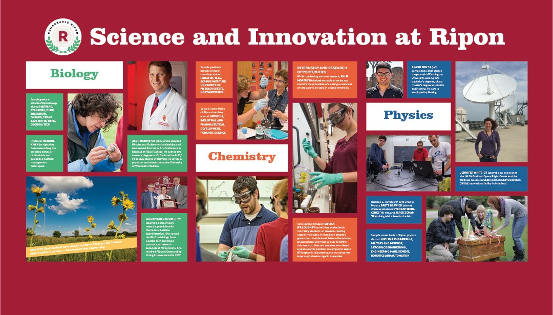
One of the first stops on the Ripon tour is Farr Hall of Science. Showing its wear, we decided to spruce up the entire first level with paint, live science exhibits, a new collaborative lounge and this entrance wall showing the faculty-student mentorship, applied learning, and outcomes.
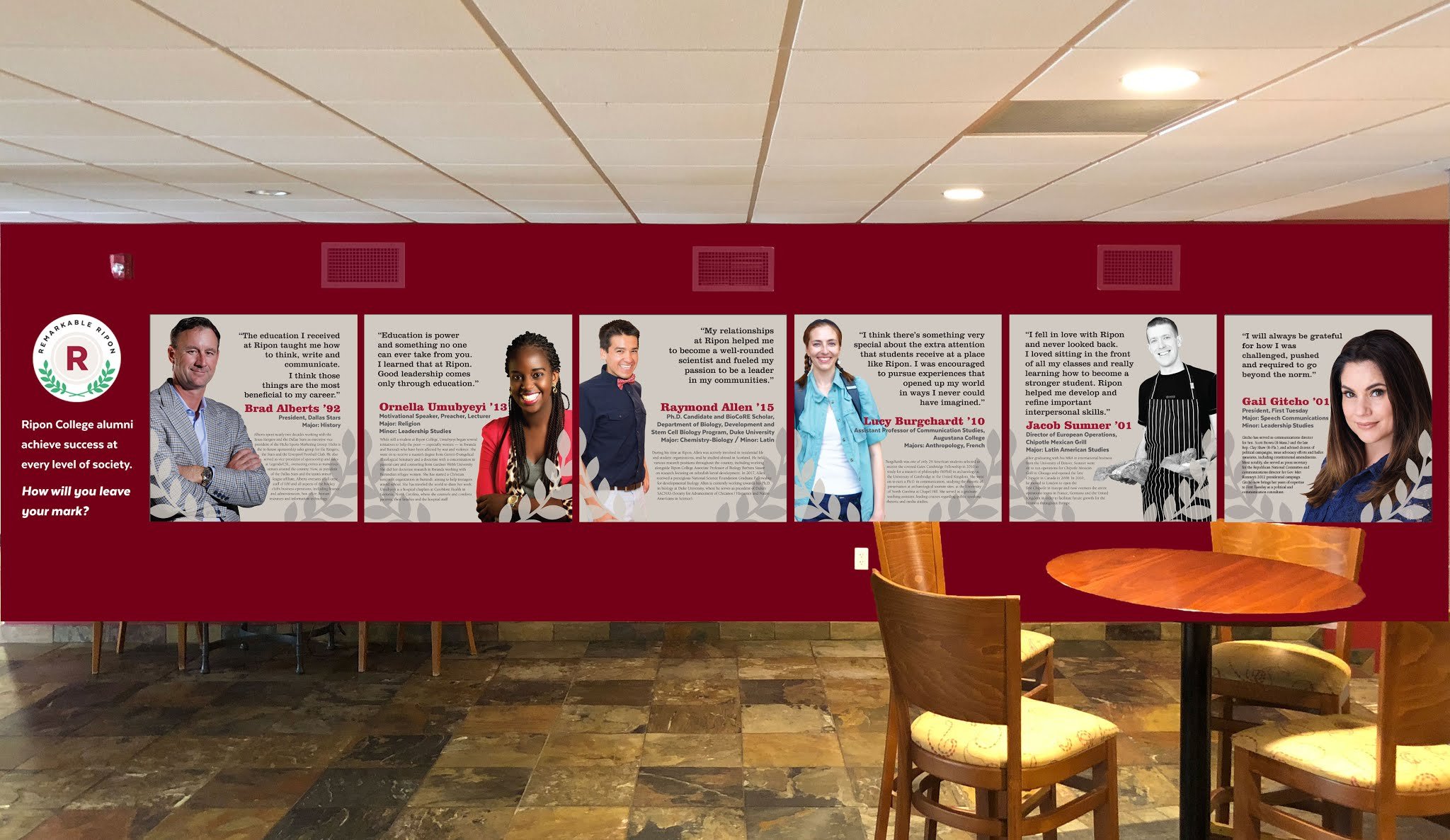
This rotating installation of inspiring alumni stories is perfectly located in one of Ripon's busiest buildings and a major destination on the tour route.
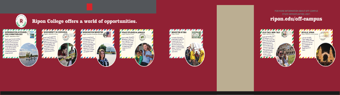
Located across the hall from the Remarkable Ripon alumni installation is the off-campus study installation that showcases Ripon's rich diversity of off-campus programming options and shares students' experiences.

This "Get Involved" wall encourages visitors to learn about the variety of things they can do as students at Ripon whether as part of student organizations, centers of excellence, or academic programs. Counselors invite students to grab as many cards as they want.

Most families nowadays are curious about an honor's program. This tour route stop ensures they have their answer.

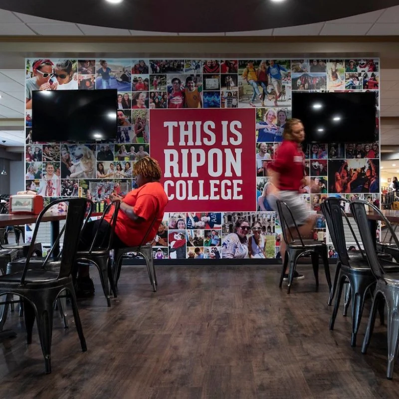
When Ripon opened its renovated campus restaurant we wanted to make sure to set expectations early on about the type of atmosphere students were entering and the casual food items available. So, we created this fun screen to welcome visitors.
Ripon College Wayfinding
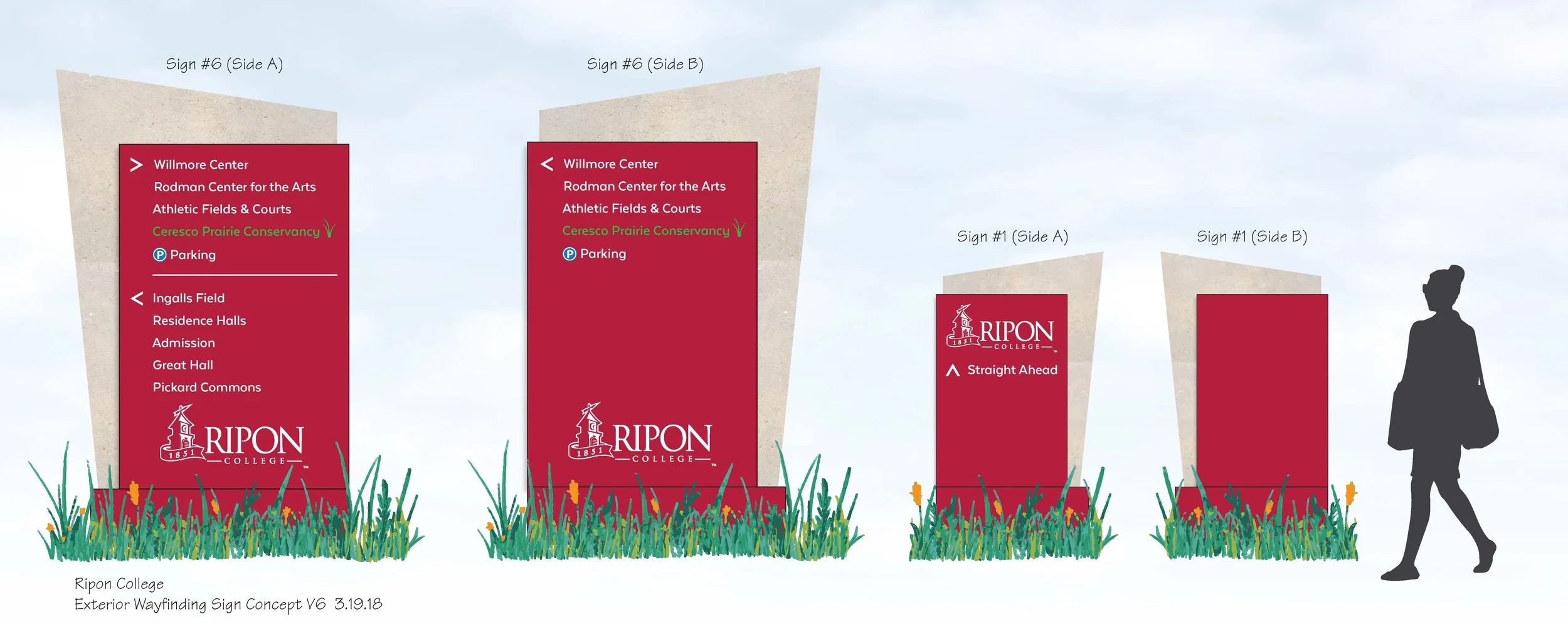
Ripon had zero external wayfinding signage other than large limestone signs with building names in front of the locations. We planned and designed these branded 8ft all-weather signs to help visitors find their way to our key buildings. The design serves as both a nod to the past and a slant to the future with the incorporation of the angled limestone backings in the direction of our clocktower.
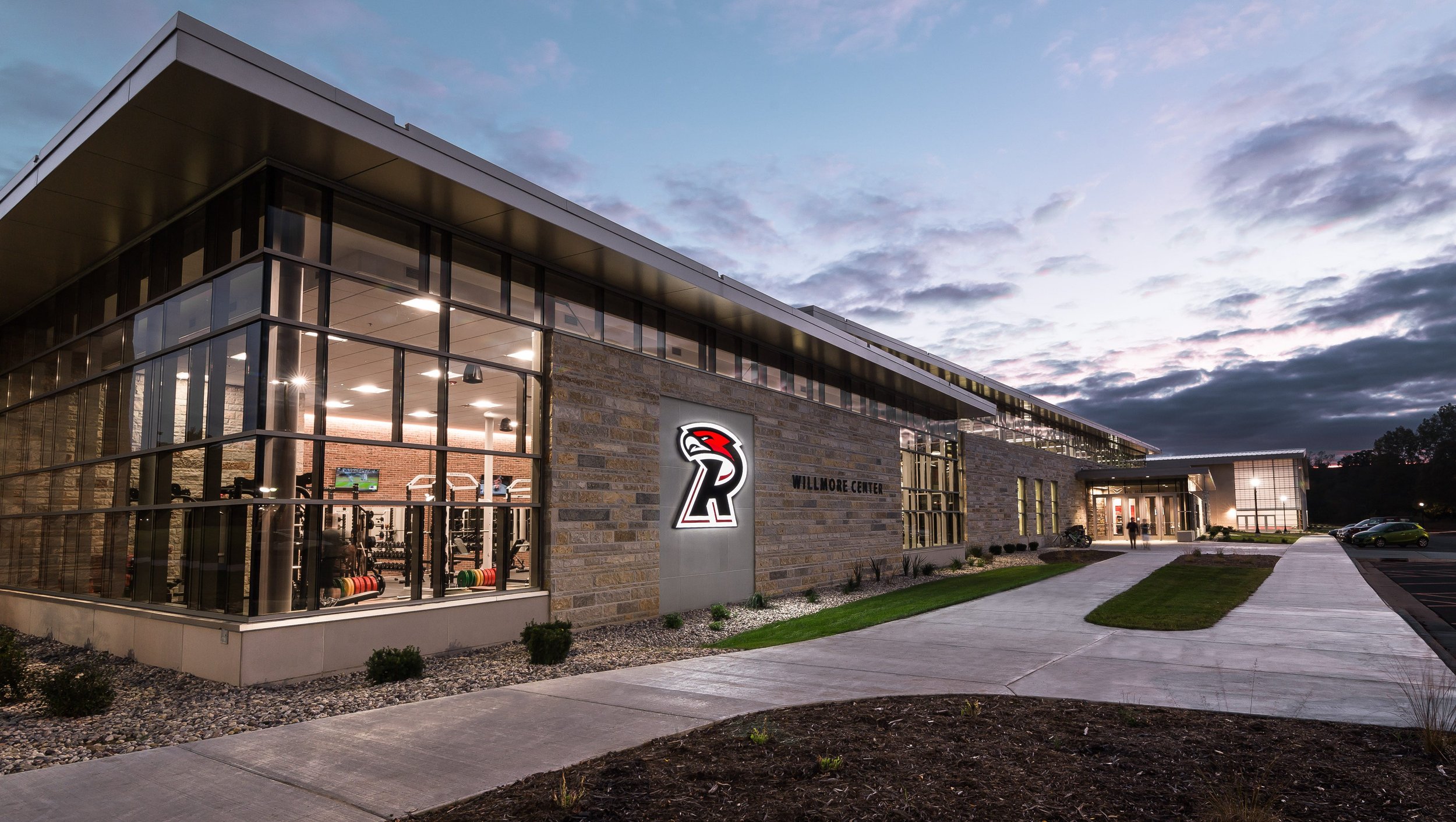
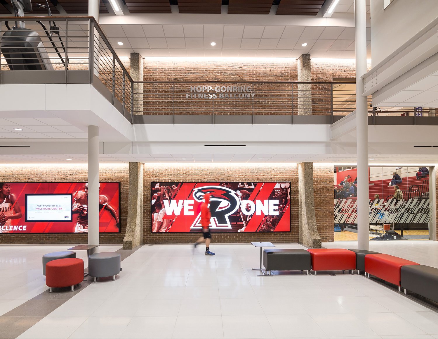
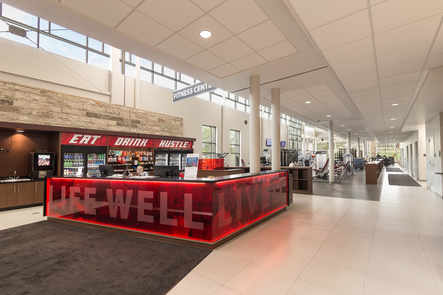
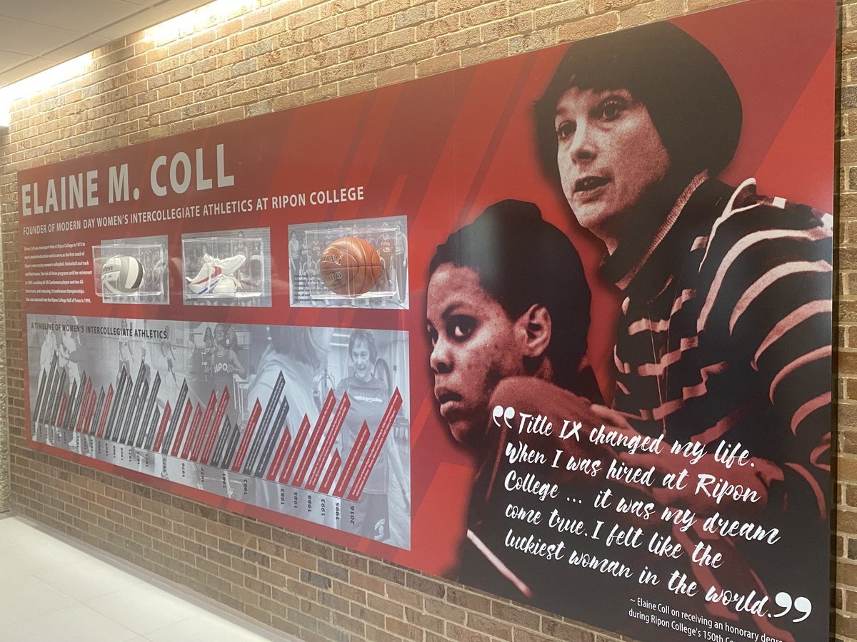
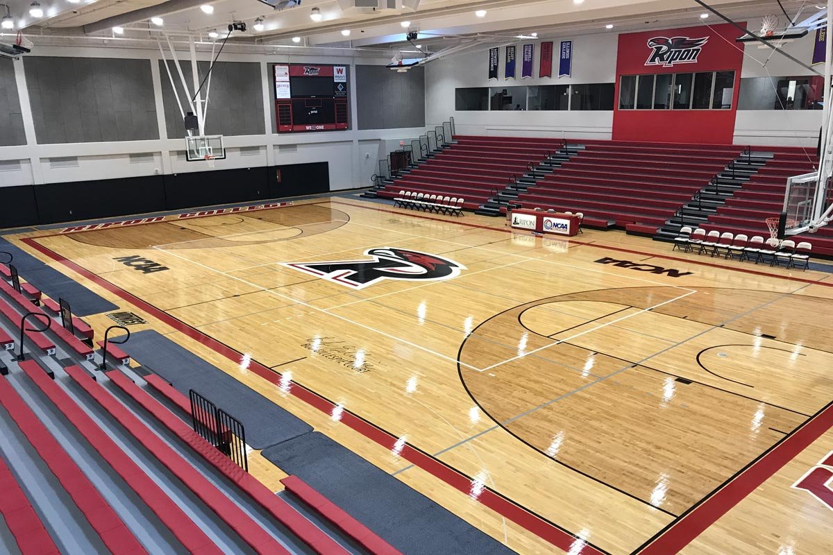
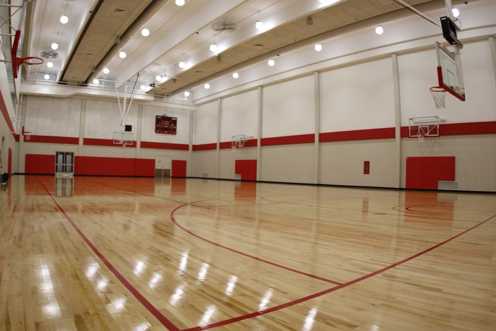
Willmore Center Branding
I oversaw the $250,000 branding package including design, printer bids, and installation, the complete materials finishing schedule, furniture plan and technology for the Willmore Center. If this was to become one of the major marketing tools for admissions we knew we needed to blow this out of the water. From the moment you walk into this building you feel the “wow!” factor. We set out to create a visually appealing experience throughout the facility, from the vibrant branded graphics to the immediate focus on the D3 student-athlete and the careful decision-making around how we paid tribute to donors, legendary coaches, and other namesakes honored throughout the building.